Why does the H5 chat page have overlapping/cropping issues?
Sometimes visitors report that the mobile web chat page is cropped or overlapping, preventing them from replying.
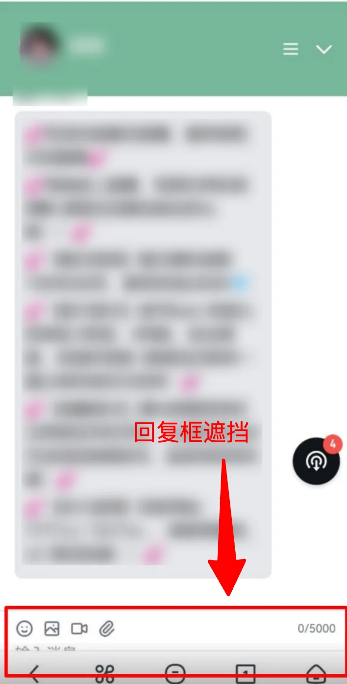
This typically happens because mobile browser address bars automatically show/hide on scroll, causing the visible page height to change dynamically. Some customers embed the chat page directly into their product via iframe with parameters that can't adapt responsively, resulting in page clipping.
Solution (only applicable for iframe embedding):
Common incorrect approaches:
/* ❌ vh is a fixed value and doesn't update when the address bar changes */
iframe { height: 100vh; }
/* ❌ dvh is dynamic but not supported by older browsers */
iframe { height: 100dvh; }
✅ Our recommended approach: Use JavaScript to dynamically calculate height, compatible with all browsers:
```html
<!DOCTYPE html>
<html>
<head>
<meta charset="UTF-8">
<meta name="viewport" content="width=device-width, initial-scale=1.0">
<style>
body, html {
margin: 0;
padding: 0;
overflow: hidden;
}
</style>
</head>
<body>
<iframe id="chat-iframe" src="YOUR_CHAT_PAGE_URL"></iframe>
<script>
function resizeIframe() {
var iframe = document.getElementById('chat-iframe');
iframe.style.width = '100%';
iframe.style.height = window.innerHeight + 'px';
iframe.style.border = 'none';
iframe.style.display = 'block';
}
resizeIframe();
window.addEventListener('resize', resizeIframe);
</script>
</body>
</html>
```
Note ⚠️
- You must set `margin: 0; padding: 0;` — otherwise extra margins will appear
- You must set `overflow: hidden;` — to prevent scrollbars
- You must set `display: block;` — iframe is inline by default, causing bottom gaps
- Don't use fixed pixel values — e.g.,
height: 800px;won't adapt to different devices